Overview
We have seen a few examples (here and here) of HTML where things don’t looks so fancy. But this chapter looks better than those examples. The content is neatly centered on the page, it’s a font that isn’t Times New Roman, there colors that aren’t the default blue. How is that possible?
The answer is through style.
HTML has evolved as an explicit semantic markup language that defines what content is, instead of how it is to be displayed. This is why we talk about emphasis and strong emphasis instead of italics and bold. To make this division clear, HTML files often rely on style information supplied by a separate stylesheet, written in a language called CSS (Cascading Style Sheets)
In this chapter, we will
- Look briefly at how CSS works.
- Learn how to apply CSS to HTML and Markdown documents.
- Learn how to extend built-in styles in Jekyll.
Important: The entire CSS specification is huge and gives authors control over every aspect of a website’s appearance. This chapter introduces the basic structures of CSS and how to use them. If you want to author your own CSS, you will need to do research into the language and learn some of the properties CSS can change.
CSS: Describing Web Styles
CSS consists of a series of rules that control how elements on a page are displayed. Here’s one now:
p {
	font-size: 3em;
	color: red;
	margin-bottom: 4px;
}
The rule consists of two elements:
- A selector
- A declaration block
The selector is anything before the left pointing brace ({), in this case p. A declaration block follows a selector and is contained within braces ({ and }). The selector tells your web browser to which elements on a page the rule applies. The declaration block contains the aspects of the matched elements to change.
Declaration blocks are further composed of declarations. A declaration contains a property and a value. The property is a string that cannot contain any spaces (words are separated by hyphens (-)) and are defined by the CSS specification. The value is separated by a colon (:) and can contain a variety of values, depending on the particular property.
To return to the above example, the selector tells the browser to match any paragraph tags (<p>) found in the document. The declaration block contains three declarations:
font-size– change the size of the font (we set it to3em, which means “three times bigger than it would normally be” in CSS)- Numerical values in CSS have to have a unit attached (unless they are
0) - For more on CSS units, check out this tutorial
- Numerical values in CSS have to have a unit attached (unless they are
color– changes the color of the text, in this case tored.- For more on CSS colors, check out this tutorial
margin-bottom– changes the size of the bottom margin (which is the space between the edge of the element and its neighbor)- CSS margin and padding, which control the size of an element, are a bit tricky.
- For more on this, check out this tutorial on the CSS box model
Writing CSS Selectors
CSS has three ways of selecting elements:
- By Tag
- By Class
- By ID
Tag here refers to the name of HTML tag, so selectors such as a, p, h1, etc., will select all tags that match the tag in question.
Classes and IDs are defined by the website’s author and are used to identify tags. A class is a group of elements (either one tag or many tags) that the user wants to share some CSS styling. An ID is a unique identifier applied to one element, individually.
To use an analogy, classes in CSS are like families: many people belong to a particular family, though they may live in different places and have different jobs. IDs, though, are like social-security numbers in the United States, you are uniquely identified by your SSN. See “Adding Style to HTML” below for more information about how to use these.
Class selectors can be named anything you want (though, like everything in CSS, they cannot contain spaces). They are written starting with a dot (.) followed by the class name.
Considering the earlier example where we changed the paragraph styles, imagine we have reloaded our site with its new CSS and realized that making our paragraphs red was a terrible idea. We still need some red paragraphs, though, so we can make a class, instead:
.red-paragraphs {
	font-size: 3em;
	color: red;
	margin-bottom: 4px;
}
Now all our paragraphs won’t have red text, but we can apply the class (which we’ll learn how to do in a minute) to certain elements (not even just paragraphs).
ID selectors work the same way but apply to only one element. They can also be named anything you want, but are written with an octothorpe (#) followed by the ID name.
Here we define a single element that will have our red font stylings:
#red-paragraph {
	font-size: 3em;
	color: red;
	margin-bottom: 4px;
}
Important Information: CSS was first published in 1996. Since that time, a series of best practices has developed around the standard, as happens with many standards. The general consensus in CSS development is that you should only use class selectors, avoiding ID and tag-based ones. Classes are the most versatile and do the best job of future-proofing your CSS code (in case you change the HTML).
Adding Style to HTML
Now that we have seen a little about CSS, let’s learn how to use it in our HTML documents!
Adding CSS to your HTML files
“CSS is all great, Dr. Pilsch,” you may be thinking, “but how do I use it?” And that’s good question!
We have to define CSS somewhere in our HTML document in order to use it. CSS can be defined inside of an HTML file (which makes it in-line CSS) or in an external .css file. The external method is greatly preferred and should be used in the vast majority of situations.
CSS is always defined inside the document’s <head> tag, as CSS is another example of metadata.
However, here is how to do both.
In-line CSS
Consider a simple HTML document:
<!doctype html>
<html>
	<head>
		<meta charset="UTF-8">
		<meta name="viewport" content="width=device-width, initial-scale=1">
		<title>Example Site</title>
	</head>
	<body>
		<h1>Page Title</h1>
		<p>Here is an example paragraph.</p>
		<p>Here is another example paragraph.</p>
	</body>
</html>
To include some in-line styles, we use the <style> tag:
<!doctype html>
<html>
	<head>
		<meta charset="UTF-8">
		<meta name="viewport" content="width=device-width, initial-scale=1">
		<title>Example Site</title>
		<style>
		p {
			font-size: 1.25em;
			line-height: 1.5;
		}
		h1 {
			color: #333;
		}
		</style>
	</head>
	<body>
		<h1>Page Title</h1>
		<p>Here is an example paragraph.</p>
		<p>Here is another example paragraph.</p>
	</body>
</html>
That will change the color of the <h1> tag and the font size and line spacing of the <p> tags.
Why Not Use In-line Styles
If you use in-line styles, you have to include the same stylesheet on every page in your site. If you then change that style, you have to change every page on your site. You have to do this every single time you change something about your design. If you have hundreds of pages, that can be a real pain.
While Jekyll’s templating system could mitigate this, HTML’s existence as a semantic markup language also means that design and content should be separate. Storing CSS in the HTML document undercuts this. Further, and we won’t talk about this in this chapter, when stylesheets are external, it is possible to load different stylesheets in different scenarios, like when our user is making use of assistive technology such as a Braille reader or when the user is printing our site. Neither of these are possible with in-line stylesheets.
External CSS Files
Ok, so we don’t want to use in-line stylesheets. What can we do?
Stylesheets can also be stored in external files with a .css extension and then connected to the web page using a <link> tag.
The previous example would split into two files, a new CSS file we’ll call site.css:
p {
	font-size: 1.25em;
	line-height: 1.5;
}
h1 {
	color: #333;
}
And the HTML, which now contains a link to the CSS file:
<!doctype html>
<html>
	<head>
		<meta charset="UTF-8">
		<meta name="viewport" content="width=device-width, initial-scale=1">
		<title>Example Site</title>
		<link rel="stylesheet" href="site.css">
	</head>
	<body>
		<h1>Page Title</h1>
		<p>Here is an example paragraph.</p>
		<p>Here is another example paragraph.</p>
	</body>
</html>
Now we have our site’s CSS loaded in from an external file!
Applying your CSS styles to HTML
But CSS can do more than just define rules for tags. We have classes and IDs in the specification, too.
To attach a CSS class to an HTML element, we use the class attribute. To attach an ID to an HTML element, we use the id attribute.
So, we could add the text-center class, which centers text, to a paragraph by writing <p class="text-center">Centered Text</p>. We could name a header “title” by writing <h1 id="title">.
Using these two attributes, we can attach the rest of our CSS rules to our HTML.
Generic HTML elements and style.
When we learned about Markdown, we talked about the difference between block and span elements (a paragraph or a list is a block in Markdown, while emphasis or a link is a span element). We also talked about this being applicable to HTML.
When we attach classes and IDs to elements, sometimes we don’t want the associated semantic meaning in HTML. For instance, we may want to italicize the name of the author of a blog post on our site, but we don’t want it to semantically mean “emphasized.” In that case, we can use what is called a “generic HTML element.”
There are two generic HTML elements, one for block elements and the other for span elements. The two tags are <div> for blocks and <span> for spans.
In our example of the author’s name, we may want to italicize the name of an author but not emphasize it. In that case, we may come up with some HTML that looks like this:
<article>
	<header>
		<h1>Title of the Article</h1>
		<time>September 20, 2020</time>
		<span class="author-name">Andrew Pilsch</span>
	</header>
</article>
Then we could generate the CSS:
.author-name {
	font-style: italic;
}
From a visual, human-focused standpoint, this is a more complicated, but otherwise comparable, to just typing <em>Andrew Pilsch</em>. However, from the web browser’s stand-point, it is not at all comparable, because em in HTML is meant to emphasize important information, while span does not have an implicit meaning. In this way, we can apply the italic styling without also implying a semantic meaning in the HTML. This is why generic tags are so important for designing the appearance of the website.
Another Example of Generic Tags: Center Content
The basic site we built in the previous section looks like this when we display it in the browser:
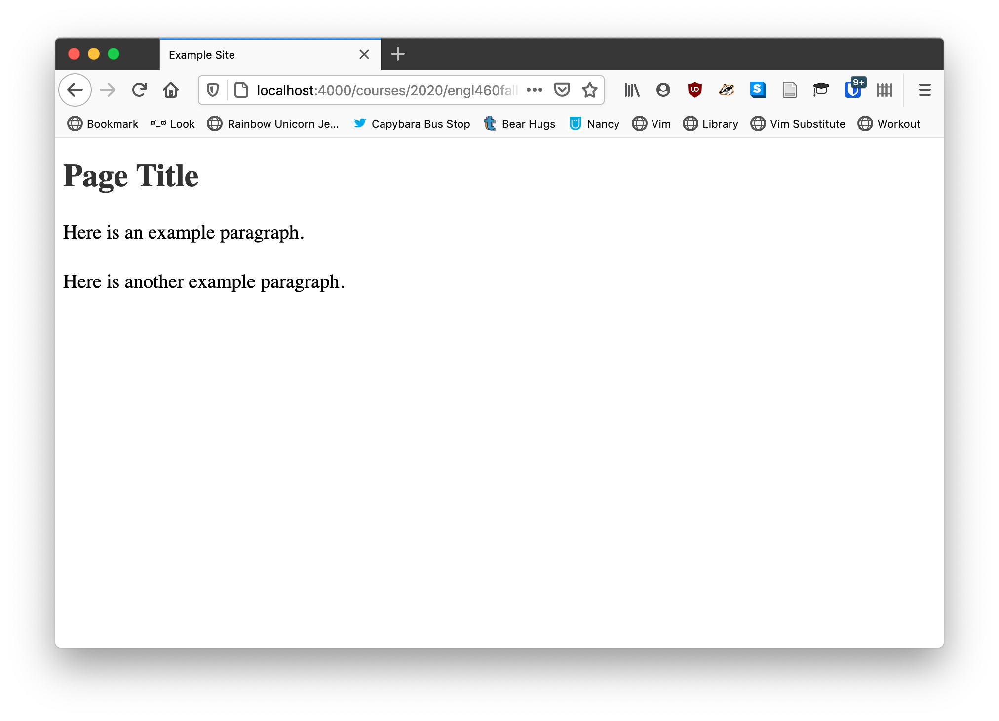
We could make the site look a little better if we centered the column in the browser so that the text was a little narrower.
We have to use a <div> for that:
<!doctype html>
<html>
	<head>
		<meta charset="UTF-8">
		<meta name="viewport" content="width=device-width, initial-scale=1">
		<title>Example Site</title>
		<link rel="stylesheet" href="site.css">
	</head>
	<body>
		<div class="container">
			<h1>Page Title</h1>
			<p>When we learned about Markdown, we talked about the difference between block and span elements (a paragraph or a list is a block in Markdown, while emphasis or a link is a span element). We also talked about this being applicable to HTML.</p>

			<p>When we attach classes and IDs to elements, sometimes we don’t want the associated semantic meaning in HTML. For instance, we may want to italicize the name of the author of a blog post on our site, but we don’t want it to semantically mean “emphasized.” In that case, we can use what is called a “generic HTML element.”</p>
		</div>
	</body>
</html>
And add to the CSS:
.container {
	margin: auto;
	max-width: 960px;
	width: 100%;
}
We get a nicely centered column of text.
The code to center a block is, counter-intuitively, margin: auto. Why? Because CSS is just like that some times. We also set a width and a max-width because it will make sure the column grows with the size of the user’s screen (say if they were on a cellphone) until it hits our desired max of 960px.
We can also use generic tags to format and define regions of our website!
Applying Style in Jekyll Markdown
Your Jekyll theme already has a variety of classes defined in its CSS. To take a look, we need to use something called “View Source,” a feature in our web browser that lets us look at the source code of a web page.
We want to look for lines that begin with <link rel="stylesheet". You could search (using the Ctrl+F or Cmd+F hotkey in your browser) for “rel="stylesheet” if you want to speed this up. These <link> tags will each contain a href attribute that links to a CSS file. Click on that in the source viewer and your CSS file load.
Unfortunately, it usually prints as a very long, single-line string that is utterly unreadable by humans. This is because Jekyll removes spaces and line breaks from CSS files when it builds your site in order to save a few bytes here or there (which would add up if we were running a website like Facebook or Google). To fix this, we can copy the CSS code and visit a CSS unminifier website (I use Unminify), which will add white space back in.
This animated GIF shows the whole process:
The CSS for primer defines a lot of useful CSS classes you can use. One I use frequently on this page is text-center, which is defined as:
.text-center {
	text-align: center
}
When applied to a block element such as a paragraph, it will center the content. I’m using it to center all the images on this page, for instance.
But how do we apply it?
Sadly, Markdown does not have a standard way to add style and class information to content. However, the Markdown library used on GitHub Pages, called Kramdown, has the ability to add style information to Markdown documents.
So, what I am about to teach you, and I can’t emphasize this strongly enough, will only work on GitHub Pages or any other Markdown application that uses Kramdown. If you end up using Markdown for anything after this class, make sure you know if Kramdown’s add-ons are supported.
Ok, to attach a class to a block element, you add a line in braces ({ and }) that contains a colon (:) followed by a list of classes separated by spaces. As an example, to add the text-center class to a paragraph, I could write:
Here is an example paragraph. It is very short.
{: .text-center}
If I wanted to turn the text blue, I would add a second class:
Here is an example paragraph. It is very short.
{: .text-center .text-blue}
This will produce:
Here is an example paragraph. It is very short.
These classes, text-center and text-blue, are both defined in primer’s CSS file, so you can’t just make up whatever you want. You need to be checking the CSS. Primer offers a lot of options for changing aspects of your document.
You can also use Kramdown’s add-ons to Markdown to apply CSS classes to in-line elements. Say we wanted to add some emphasized text to our paragraph and turn it red. We could do the following:
Here is an example paragraph. *Here is some red emphasized text*{:.text-red}. It is very short.
{: .text-center .text-blue}
Which produces:
Here is an example paragraph. Here is some red emphasized text. It is very short.
This only works because of the emphasized text. You have to define an in-line element in order to modify it in Markdown, which is the one limitation to the way this is done in Kramdown.
Now, let’s talk a little more about writing complex CSS selectors.
Compound CSS
But can we only apply CSS to single kinds of elements, classes, or IDs? Thanksfully, not. We can make nested selectors and we can combine selectors to make more complex and useful rules.
Nesting Selectors
HTML, as you remember, is a hierarchical markup language, with children elements contained within parent elements. CSS can write selectors to take advantage of this structure.
Sometimes you may need to target a particular element inside of another. For instance, say you were adding the class phone-numbers to some <ul> tags in your document. You need to do some formatting on the li tags in each list. In CSS, you can write a nested selector, which combines two selectors in sequence. We could write:
.phone-numbers li {
	font-weight: bold;
}
Now all the li in our phone number lists are going to be bold. You can read this selector from right to left as “target all list items contained within an element with the class phone-numbers.” The space establishes a parent child relationship in CSS.
Note on Parentage
In CSS, and this can be very frustrating to remember, the parent child relationship is not immediate in nested selectors, so the above CSS selector would match all the <li> tags below:
<div class="phone-numbers">
	<div id="customer-phone-numbers">
		<ul>
			<li>123-456-7890</li>
			<li>123-456-7890</li>
			<li>123-456-7890</li>
			<li>123-456-7890
				<ul>
					<li>123-456-7890</li>
					<li>123-456-7890</li>
					<li>123-456-7890</li>
					<li>123-456-7890</li>
				</ul>
			</li>
		</ul>
	</div>
	<div id="enemies-phone-numbers">
		<ul>
			<li>979-867-5309</li>
			<li>979-867-5309</li>
			<li>979-867-5309</li>
			<li>979-867-5309</li>
		</ul>
	</div>
</div>
Even though none of the above li tags are direct children of the element with the phone-numbers class, they are all children in CSS’s eyes.
Direct Parent -> Child Relationships
In CSS, to select only direct children of a particular parent, you can separate the two rules with a less than symbol (>). So, .phone-numbers > li will only select li tags that are the direct children of a .phone-numbers class.
<ul class="phone-numbers">
	<li>I will be styled</li>
	<li>I will be styled
		<ul>
			<li>I will not be styled</li>
		</ul>
	</li>
</ul>
In the above examples, only the elements that contain “I will be styled” are targeted by .phone-numbers > li.
Combining Selectors
Rules can also be combined outside of nesting. The most common usage for this is applying styling to all six levels of headings in HTML. To do that, rules are separated by commas (,). For instance to change headings from bold to normal weight, we could use the following CSS rule:
h1,
h2,
h3,
h4,
h5,
h6 {
	font-weight: normal;
}
This lets us combine selectors quickly and efficiently.
Note on Styling Styles: Many CSS style guides suggest placing a linebreak after a column to better emphasize each selector in a combined selector, but it is not required by the specification. It is merely done for readability.
Creating New Styles
We have already talked about overriding the default template files in order to add our own design elements to our GitHub Pages blogs. Thankfully, we can also extend the existing CSS of our theme and add our own elements to create custom CSS rules.
For any CSS theme, we do this by creating a file called assets/css/style.scss (Make sure to note the extension is .scss and not .css). We then add the following content to it:
---
---

@import "{{ site.theme }}";
We can then add any custom CSS rules we might wish to define after the line beginning with @import.
If you’re curious about what this is doing, we are adding a blank YAML header to the style.scss file to tell Jekyll to manage the file. Then, the @import line tells Jekyll to include the content of a particular file in our file when it builds the site. The {{ site.them }} tells Jekyll to automatically use our site’s theme as the file to include. One other thing to note about all of this, the file is called style.scss because it is actually using a language called SASS, which is a ridiculously powerful version of CSS that does a lot of things we won’t be working with in class. However, if you are interested in learning some of the tricks lazy web developers use to manage complex CSS projects, SASS is a good place to start.
Using Developer Tools to Edit CSS Live
We talked previously about using your browser’s developers tools to edit HTML live in the browser. The truly powerful aspect of developers tools, however, is that it lets you edit CSS live in browser, as well, which is very useful for building custom CSS classes.
When clicking on an element in the source view of developers tools or inspecting an element, the pane to the right of the HTML view displays all the style rules applied to the current element. You can edit them and add new ones if you wish. This can be very helpful when adding new rules and getting everything to look right. Just remember that if you reload the page, any changes you make are gone.